 Automotive Tech Solutions
Driving Success for Your Dealership with Connected Solutions
 Schedule a Demo Today
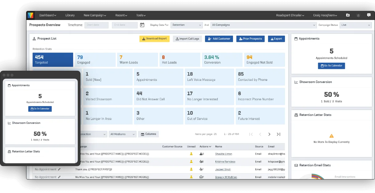


 Scroll to learn about our Marketing Solution
Customer Lifecycle Management that Converts for Every Department
Here at Vicimus we partner with dealerships to deploy top-tier solutions to expertly identify and engage highly qualified opportunities within your existing database. The result is reducing your reliance on traditional marketing spend, while bolstering your recession-proof book of business through retention and intent mining. We will create new revenue streams in Sales, Service, F&I, Parts and any other customer-facing departments or initiatives.
 OUR PRODUCTS
TECH THAT KEEPS YOUR DEALERSHIP ON TOP
Pick from a library of campaigns to reach new and existing customers through direct mail, email, SMS and ringless voicemail. Run campaigns for promotions across multiple departments.
view-product Bumper Inventory AdsCONQUEST AND RETENTIONCUSTOM DEALER WEBSITES IN A CLICK
Engage new audiences with quick conquest campaigns. Track responses in real-time for individual prospects.
view-product Bumper FinanceBUMPER FINANCE
Are you maximizing every opportunity for a customer to customize and protect their vehicle?
view-product Accessory AcceleratorAccessory Accelerator
Every new and used Vehicle Purchase and every Service RO should have the opportunity to customize their investment!
view-product Glovebox WebsitesCustom Dealer Websites in a Click
Choose from a vast selection of website designs, customize pages to promote your vehicles and easily make changes to your website when needed.
view-product Odometer VoIPBetter Tracking for Better Calls
Odometer is a future-friendly tool which tracks all your calls. It can help you save up to $700 per month compared to outdated analog phones! So, give us a ring?
view-product Powersports Independent (PSI)Powersports & Independent Car Dealer Solutions
Scaled Solutions for the Independent and Powersports Markets targeted to your specific needs!
view-product Calls on Demand (COD)Calls On Demand BDC Services
Full spectrum of Inbound & Outbound Call Services for sales and service customer conquest & retention
view-product Contact Us
 Happy Clients, Happy Us
We Thrive Helping Our Clients Succeed

Maria and the team at Vicimus are one of the best and most reliable vendors that I have ever worked with. The level of customer service that our organization has received has been first class and better than most vendor relationships I have experienced in over 20 years.
Julia Shauf

Bumper has got it right - the right message to the right people at the right times.
Kristi Alguire
AUTOMOTIVE MARKETING PLATFORM FOR CONQUEST AND RETENTION
Have you been frustrated asking your vendor partners for assistance and support and not getting what you need? Here at Vicimus not only do we understand your challenges but we pride ourselves on being responsive to all your needs and if we haven’t heard from you for a minute, we will proactively reach out to see if there is anything we can do to help!
Do More with Vicimus

CREATIVE SERVICES
Our creative team is equipped to deliver quality content and design for all your marketing needs.
I.T. SERVICES
Keep your store connected and profitable with the latest networking gear, security and our in-house support team.
BDC SERVICES
Give your sales and service departments the boost they need with all-round business development and call centre strategy.
ENHANCED MANAGEMENT
When you get Bumper, you get a Marketing Manager. A dedicated marketing expert who can help you and your team plan and execute successful campaigns for each department.